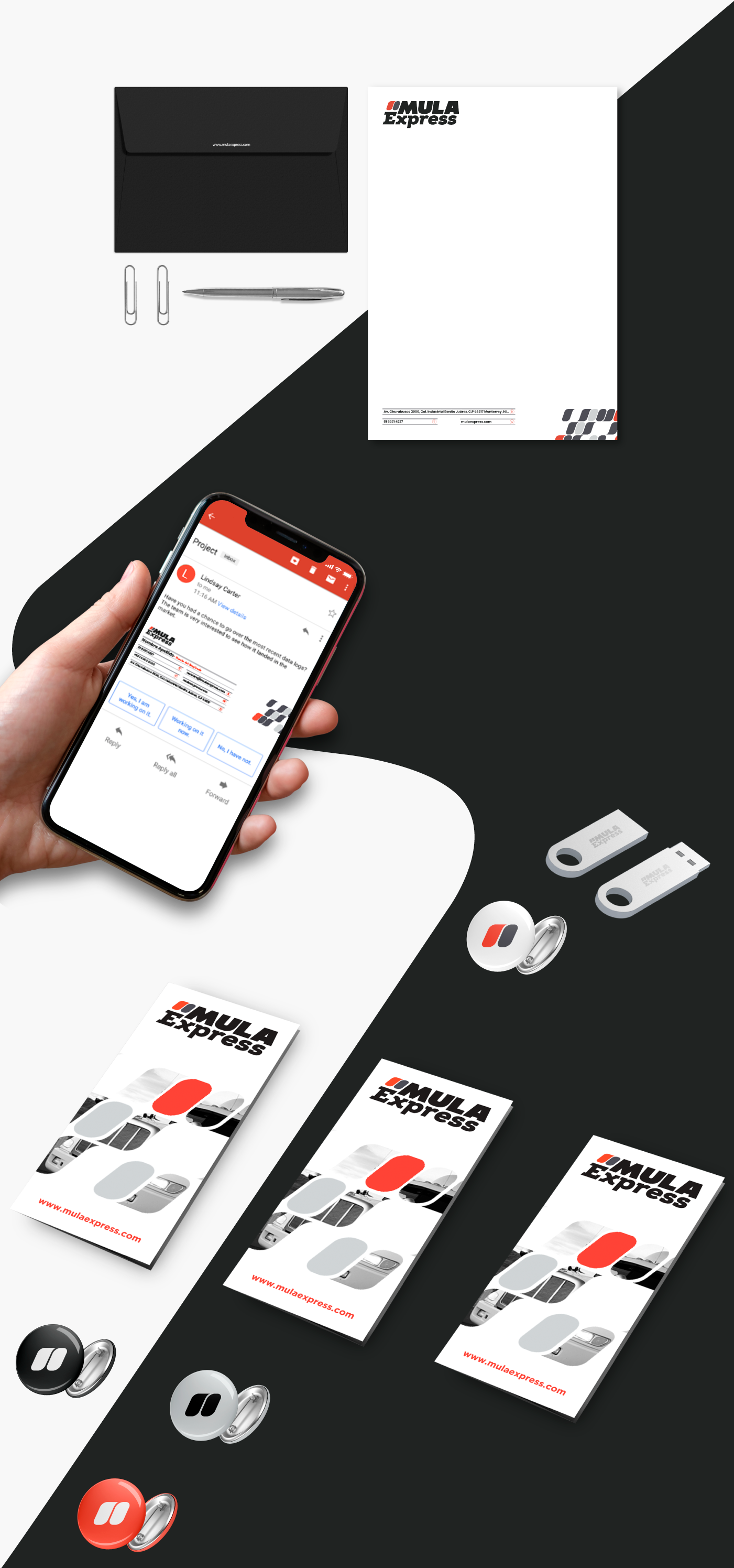
Mula Express offers Industry Logistic Services in Monterrey and Metropolitan Area. For this brand, the challenge was to position it as a reliable option with good prices.
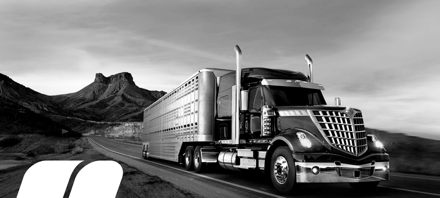
The name "Mula" (mule in Spanish) stands for its own meaning, since it has been used historically to transport supplies.
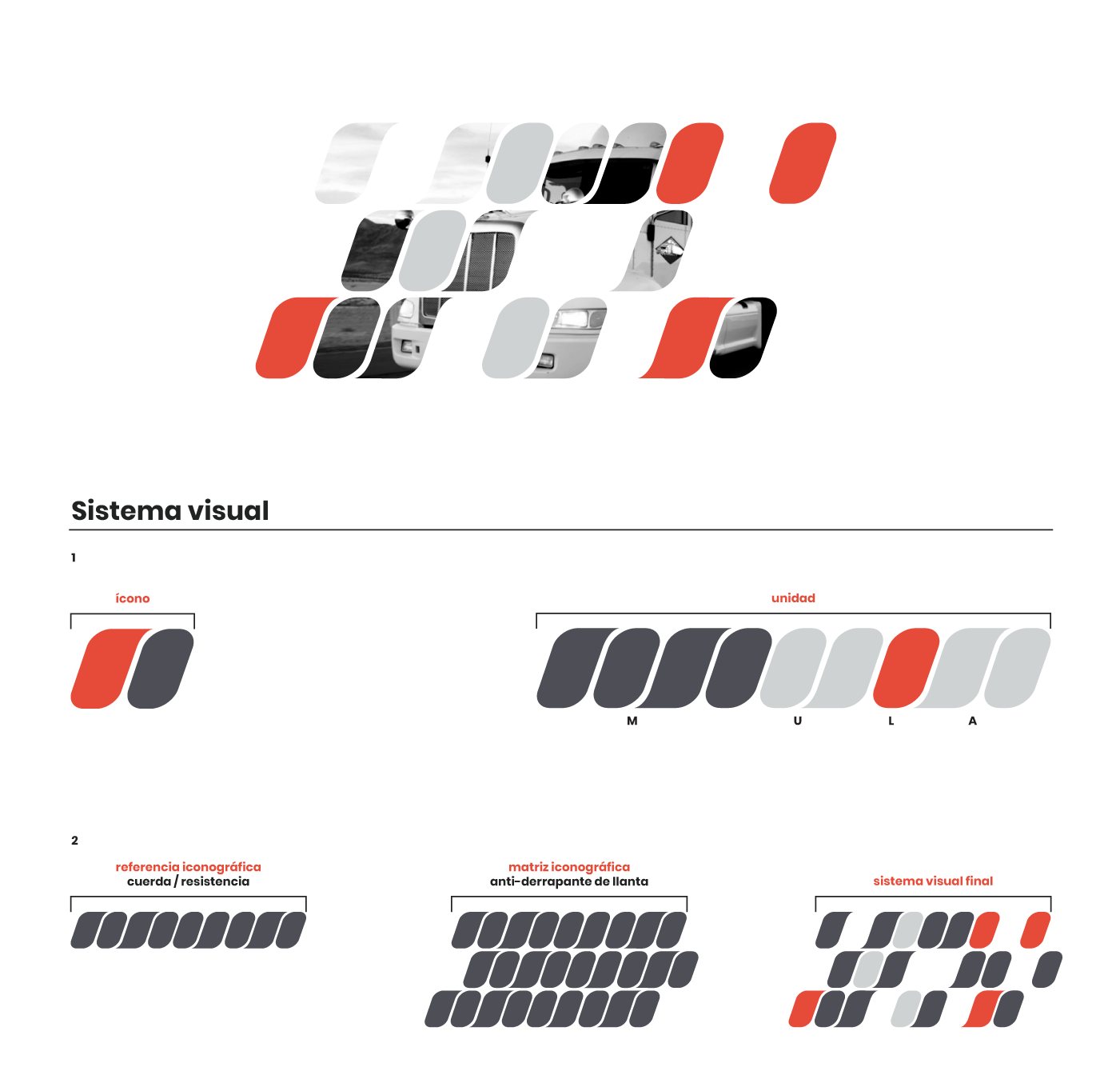
We based the graphic identity upon the Strength concept, one of the main characteristics of the Mule. This is an animal that resists the load or long hours of work, specifically in transport.
We based the graphic identity upon the Strength concept, one of the main characteristics of the Mule. This is an animal that resists the load or long hours of work, specifically in transport.

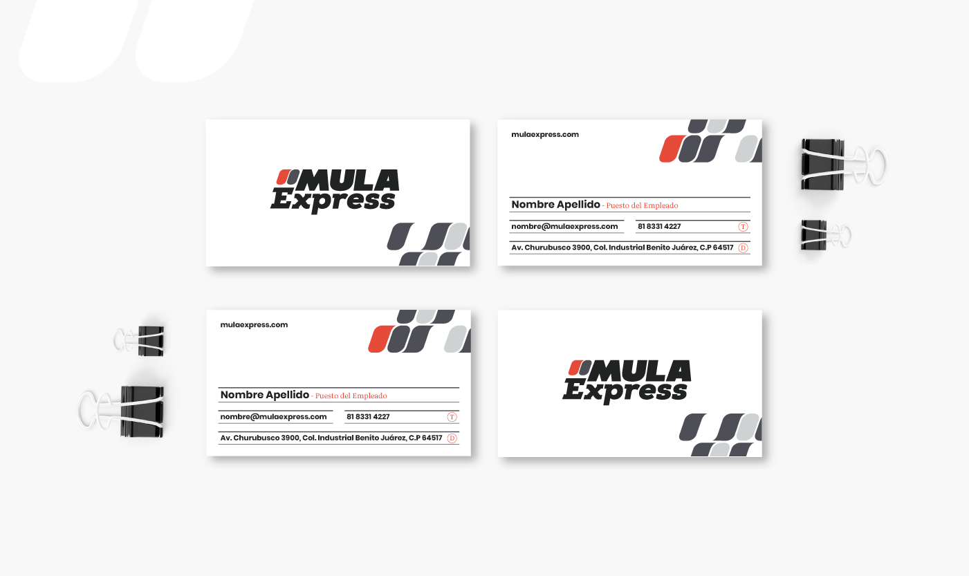
An extra bold typeface was chosen for the word Mula, which gives strength to the Serif form and endings to the word Express, adding more support elements to the typography, following the path of resistance to which allusion is sought. The logo is slightly tilted to the right, as it is a brand that expresses movement.
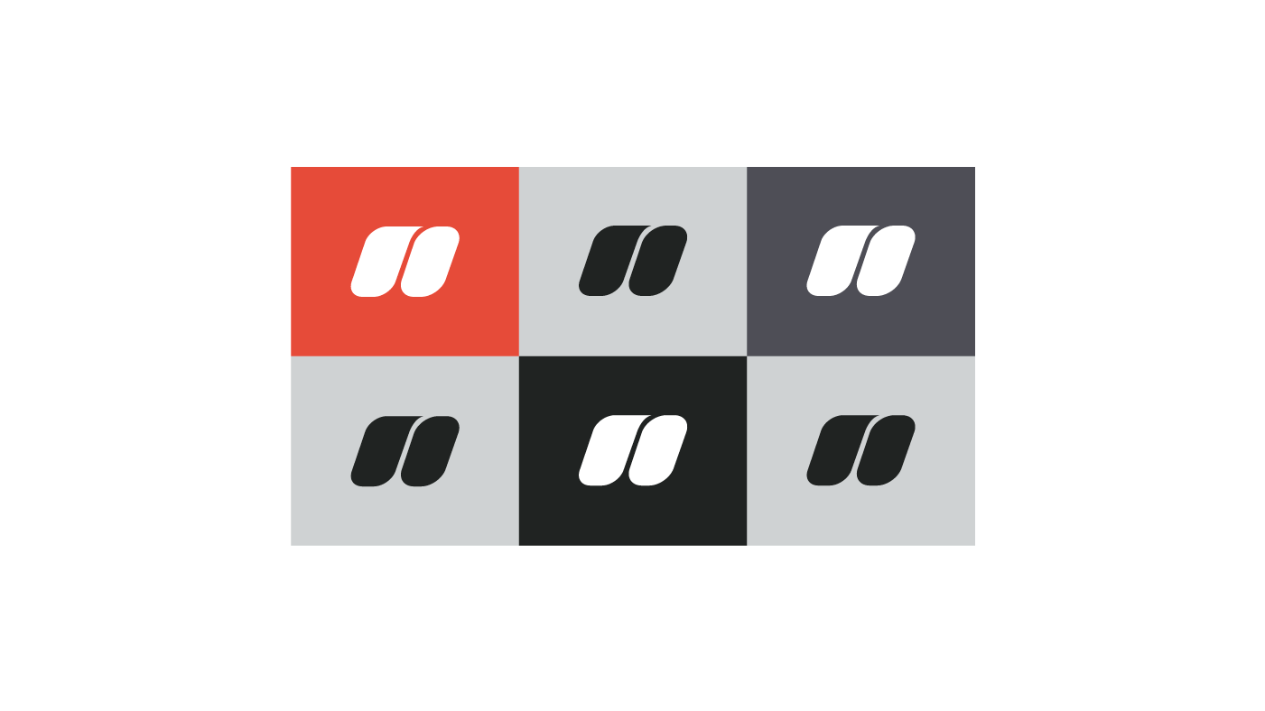
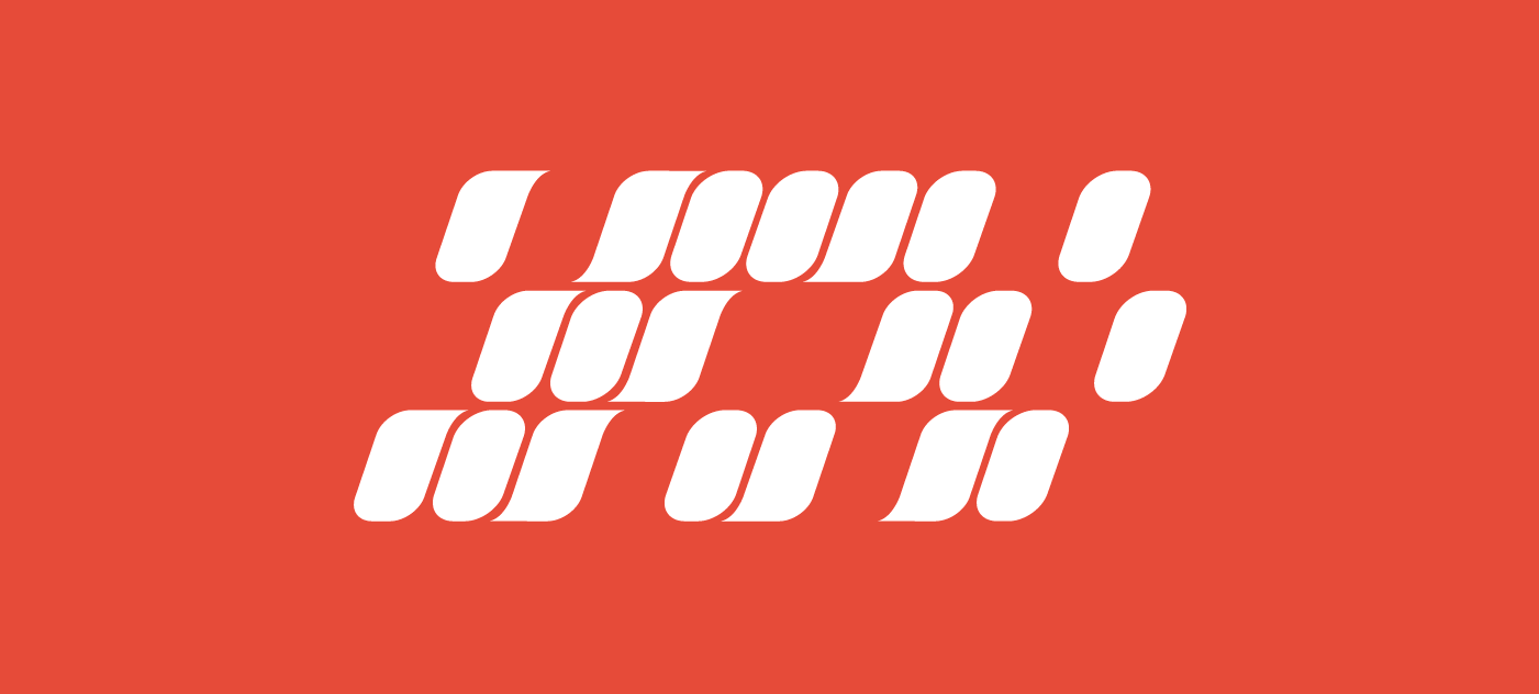
On the left side there is a set of figures that seek to be a key representation for the brand, its shape and adaptation is explained in the following slides. For the color palette the black, gray tones associated with resistant metals and red, a color that represents strength and energy.